
About
J Plus Architects - Case Study
J Plus Architects is an Architectural firm with different divisions. They commissioned me to rebrand their identity.
I designed the Logo, Brand Identity, and full business system complete with a custom modular brochure system. The entire process took over a month of work. I'm going to try to briefly explain the creative process that led to the final system.
THE PROBLEM
JPlus architects needed a comprehensive business system that convey's the brand's values across multiple media formats and marketing assets. JPlus felt their existing business system was inefficient.
"The logo is not completely useful in all platforms as it is not always applicable with its gradients, it doesn't work well at all sizes, and it lacks a coherent form that expresses the company values. A complete business system does not currently exist. We apply the logo to media in different formats, positions, sizes. The system lacks consistency and does not convey a striking personality. It's lacking in both form and function. We assmble our marketing assets for clients in a Dr. Frankenstein fashion. Overall, the system lacks a strong sense of identity." - JPlus staff
The Business System needed to be consistent. It also needed to be enduring in the way that the thematic structure of its motifs can be translated to future media outlets and systems. Its characteristics needed to be sturdy in their nature while simultaneously allowing for adaptability. They had several divisions and where anticipating expansion. They wanted a system that would distinguish their diversity while unifying them under an over arching visual identity.
THe ORIGINAL LOGO

This was their logo. As you can see it's pretty busy. It's not very practical or efficient as screen printing in large quantities at the time made gradients a hassle. The gradients also made it difficult to place their logo on their blueprints.
They stated that they wanted a logo that would work just as well in black and white as in color so that it could be easily incorporated.
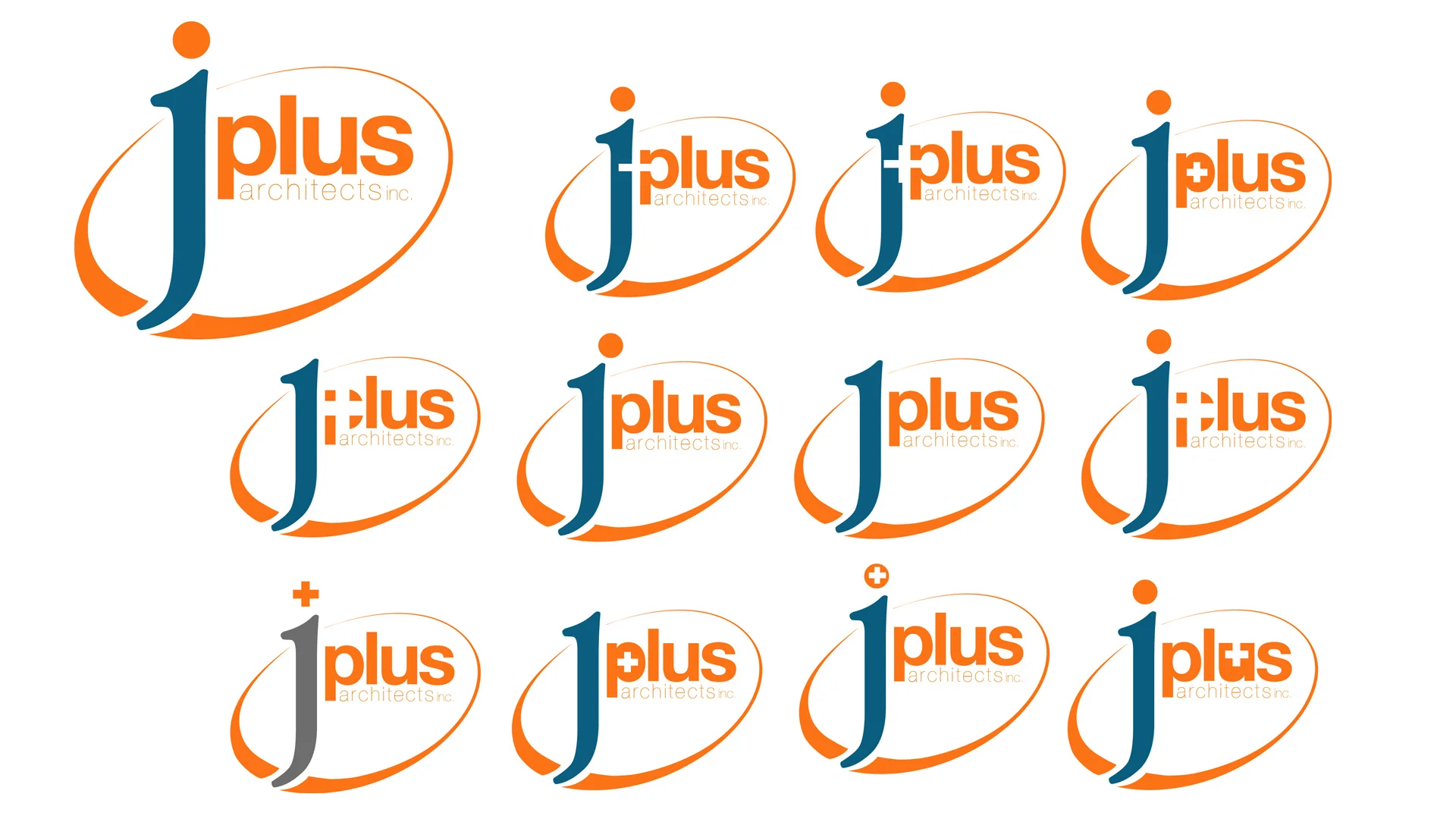
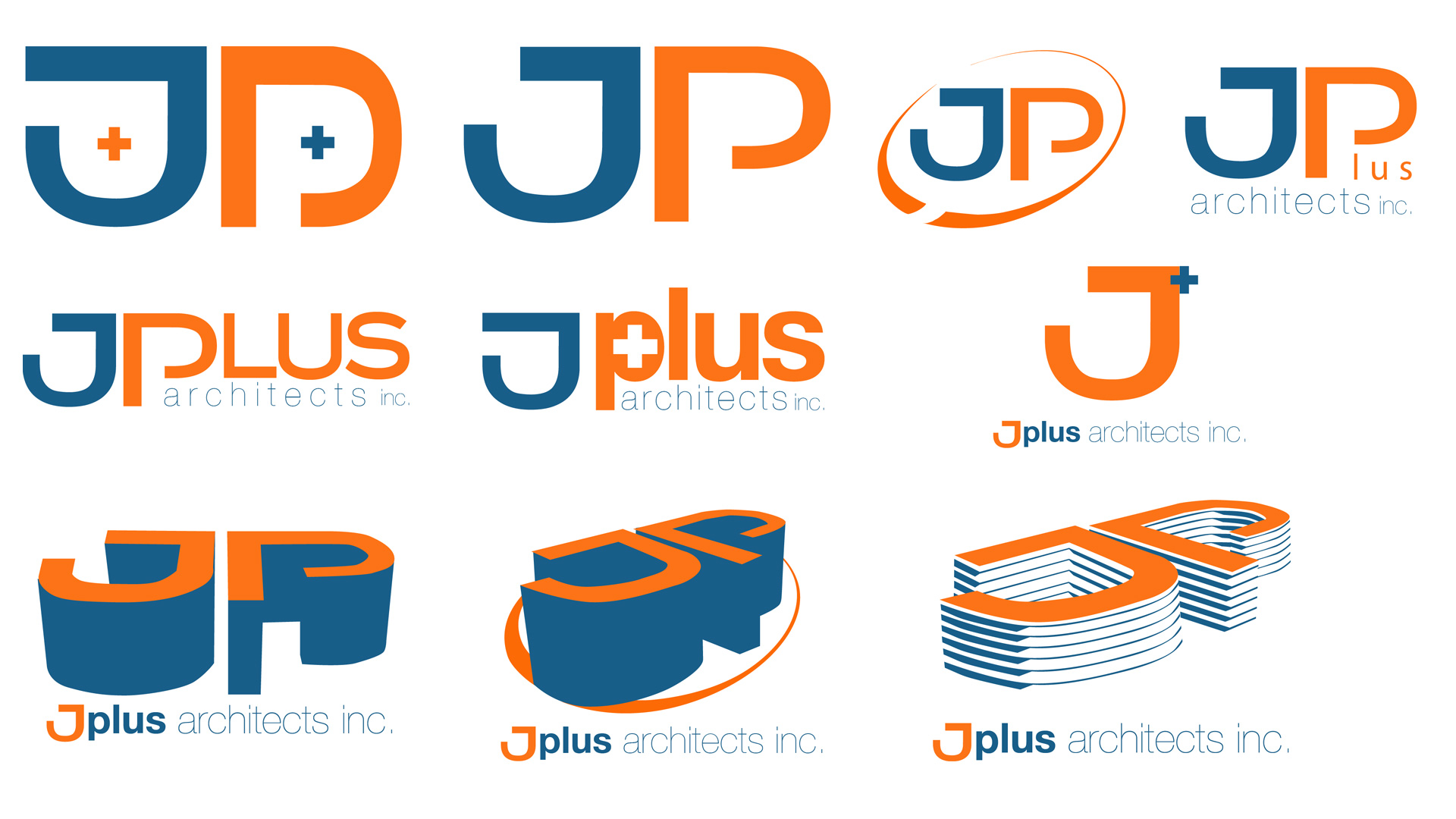
EARLY DEVELOPMENT
The first step was to start with the existing logo and explore improvements through the creation of thumbnails.
Initially they wanted to keep aspects of their current logo in the new re-brand, so I kept the colors the same
and tried exploring similar shapes and layouts.
Logo Form Development
After the initial thumbnail process and after getting some feedback from the client about what they liked and what they didn't, I started working more specifically on the logo form itself.
They really liked the large J shape so I started with that.
(Below is an excerpt from the original case study)
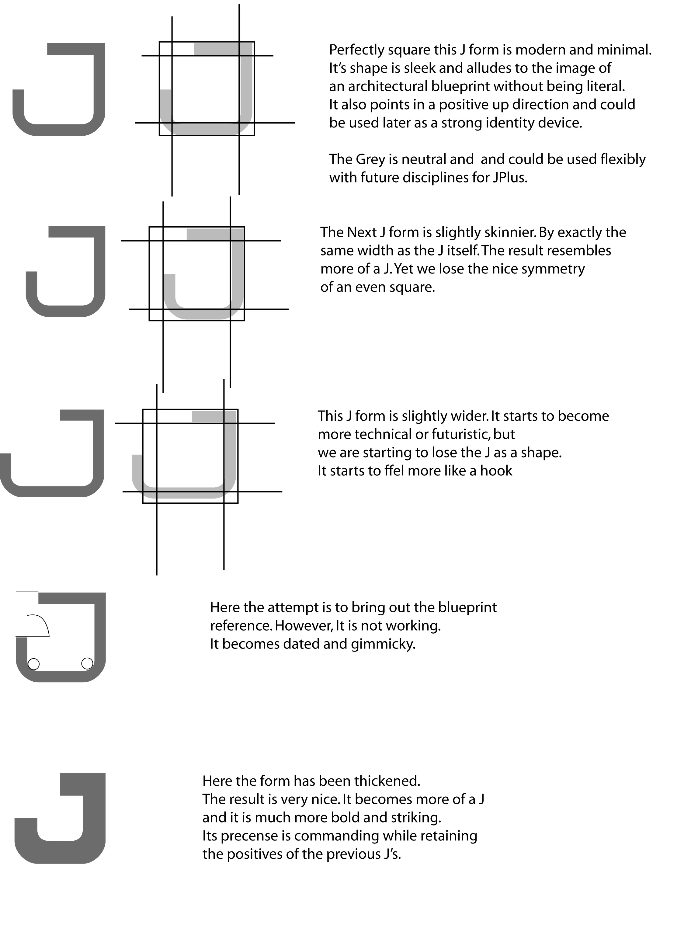
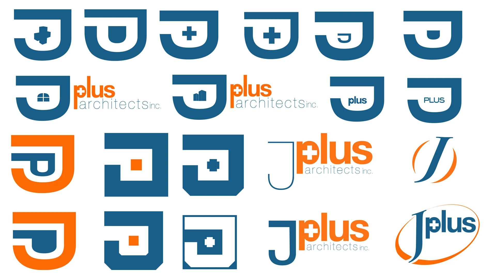
This is an excerpt from the case study notes that I was submitting to the client. I had diverged away from their old logo look and started to search for a more minimal way of expressing architecture within the mark. There was something about the J that reminded me of a blueprint and also said something about spaces.
Building architecture is creating a space that people occupy. The square form of the J seemed to signify a space that could be occupied.
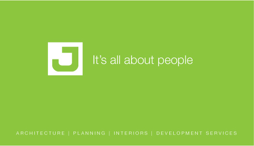
The Final Logo Mark

This is the Final Mark that was chosen. In the end I was really happy with it. It is a J, a minimal blueprint, a structure, a space, an upward diagonal pointing arrow, and the curves pull you in but the opening allws the eye to flow out.
The Square communicates a sense of sturdiness.
It feels solid. It's positive. The slight asymmetry helps generate interest.
From there I worked on the Logo layout.
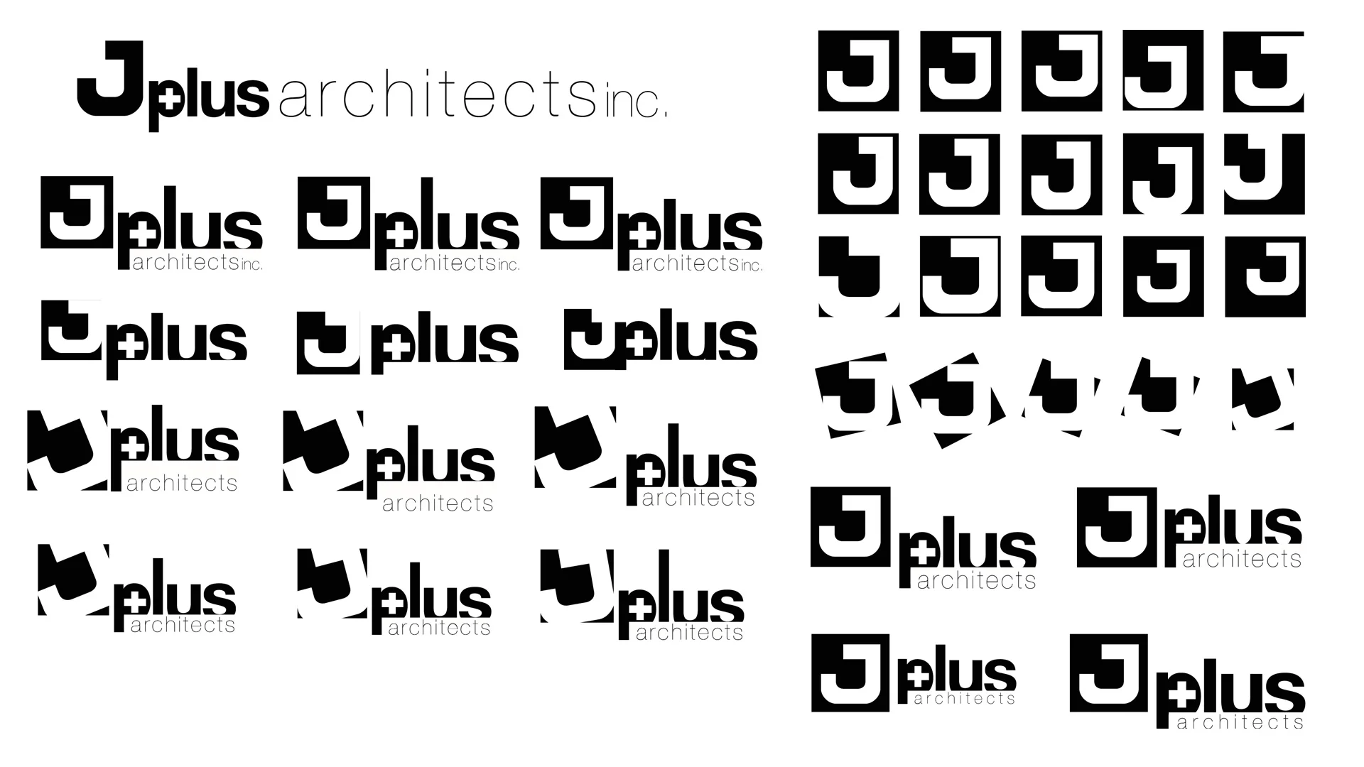
Once I found a nice layout with good space and grid, I started working on the color system.
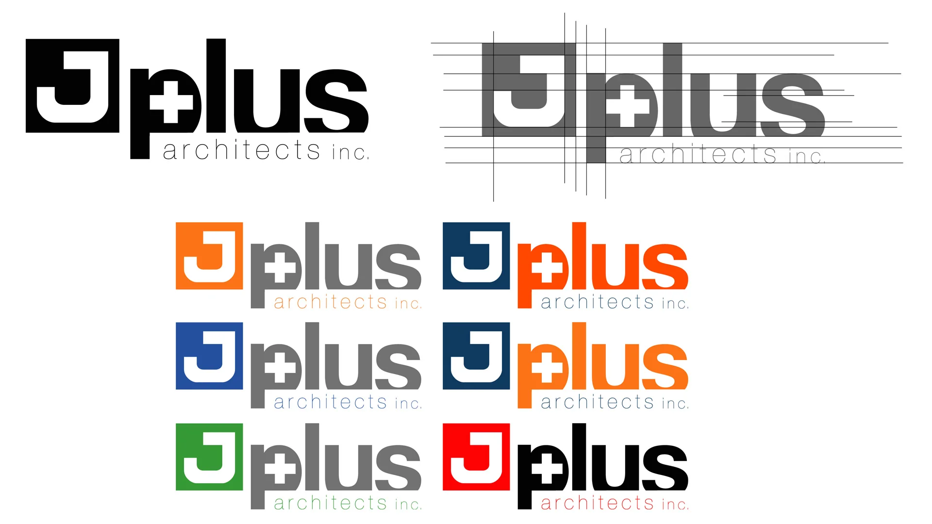
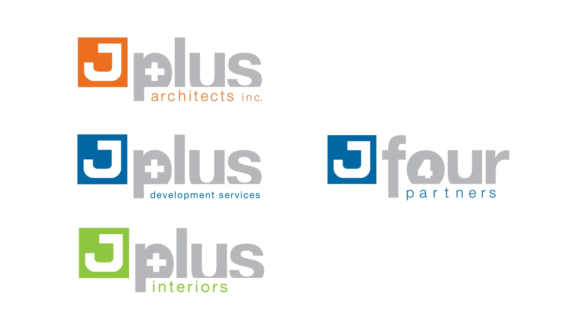
This Was the Final Logo

Below are the final Division Logos and Colors
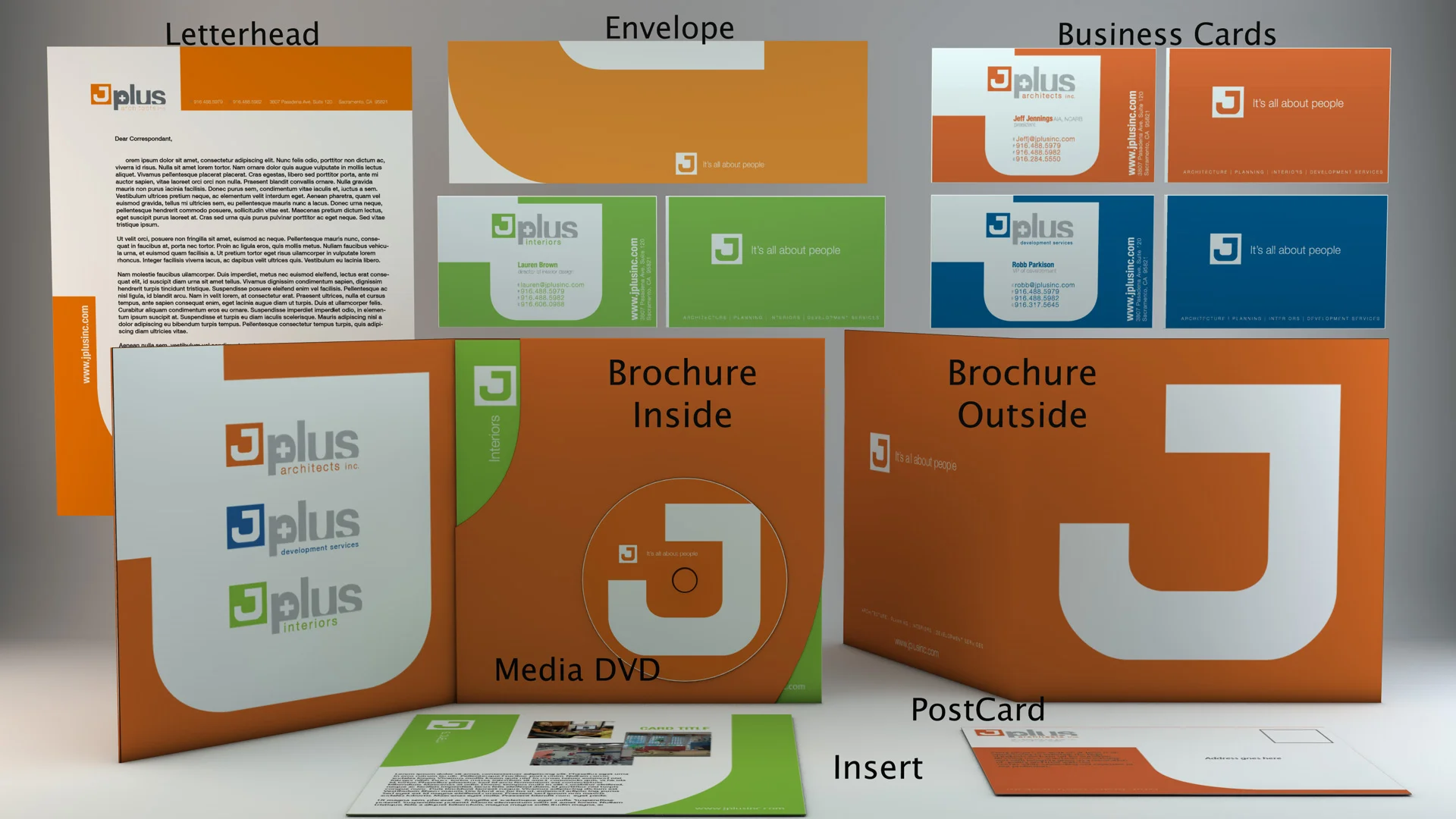
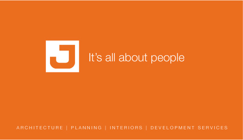
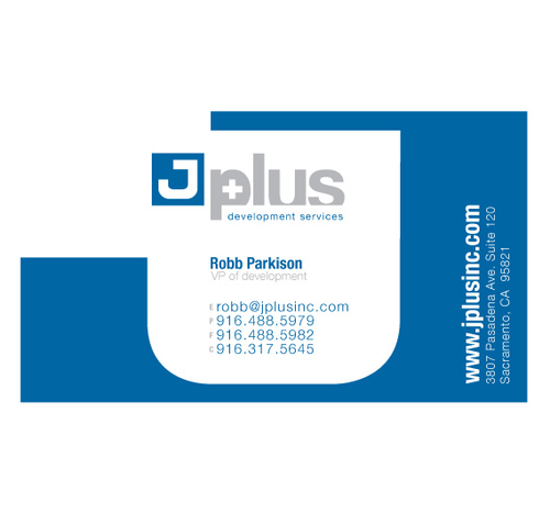
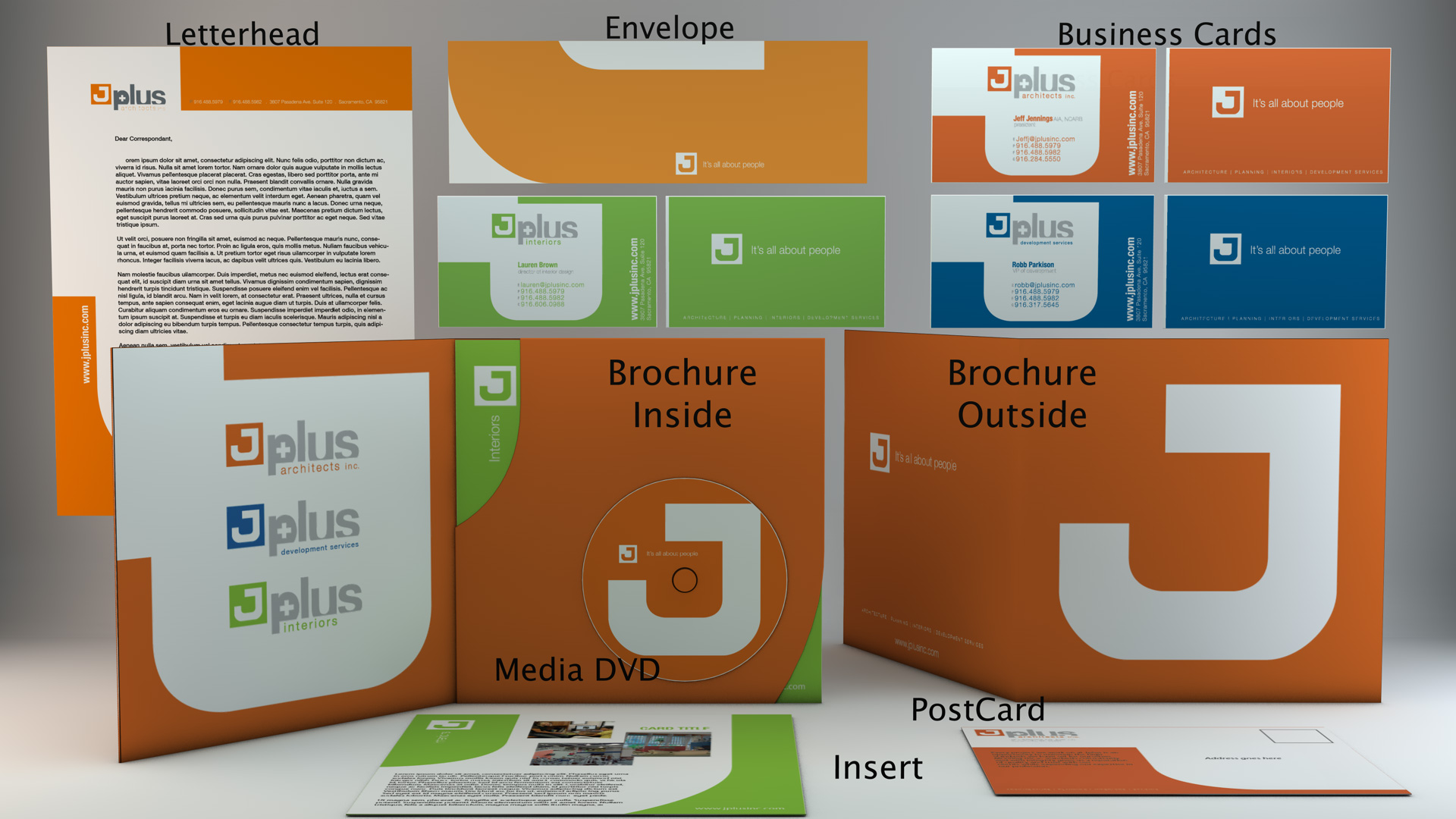
The Business System
The next step was to design a business system.
I came up with the idea of using the J from the logo mark as a tool for laying out the information that gave the layouts an architectural space for the information to occupy. It created a sense of enclosure and space as in a building.
I used the color system to distinguish the different divisions.
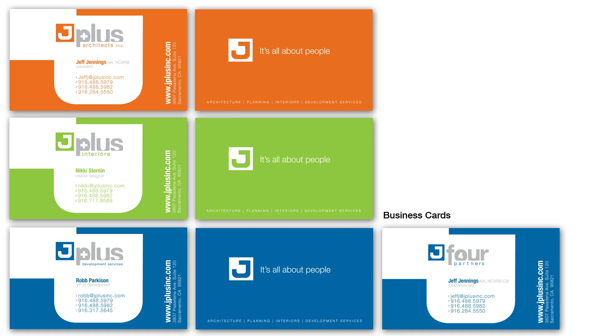


Letterhead and Envelopes
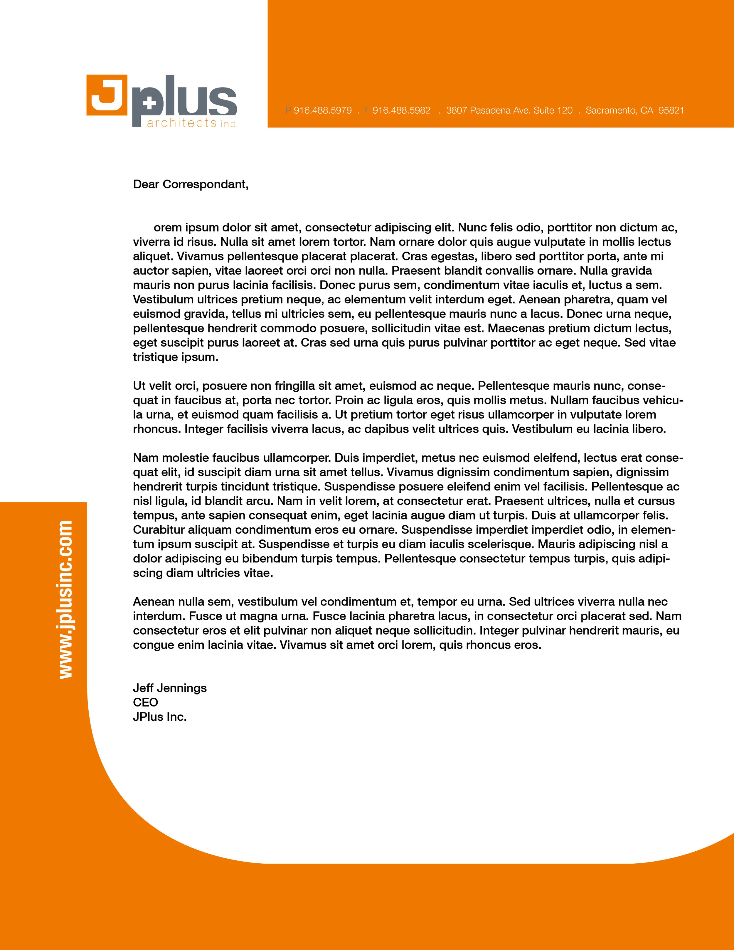
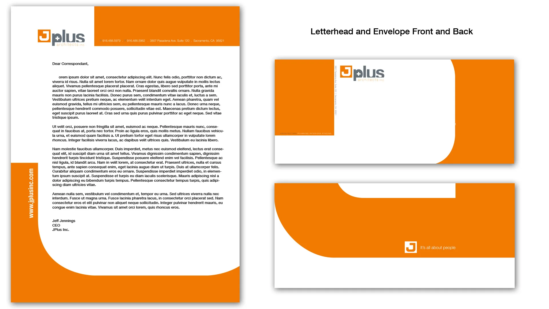
The Final letterhead that was chosen was both consistent with the business card and it was nice how the di-cut envelop was a J that wrapped around the envelop.
When you opened the envelop, you could see the J as it unfolded.
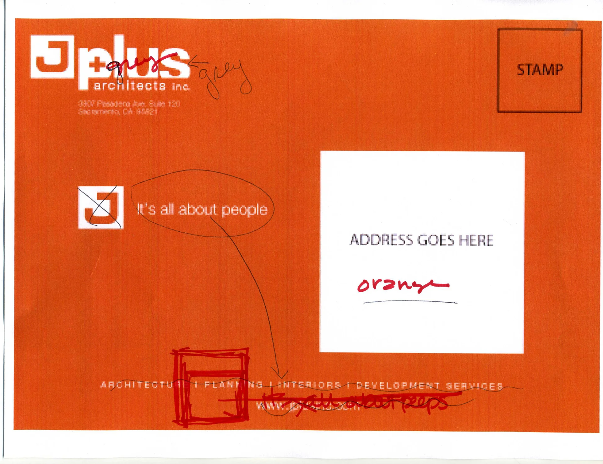
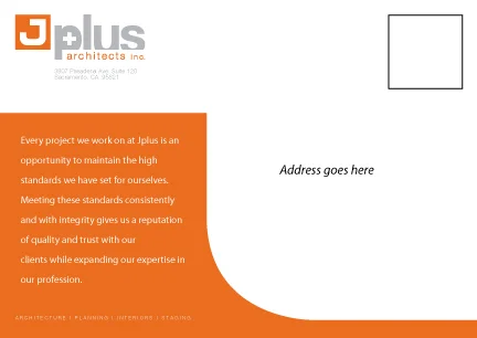
The process was long, yet rewarding. This is a scan of notes that were written by the clients on the post card design.
This was the final Postcard Layout
The Brochure
The last challenge was to create a modular brochure.
They wanted to order prints of a Brochure system that they could customize the inserts for depending on the client it was being sent to.
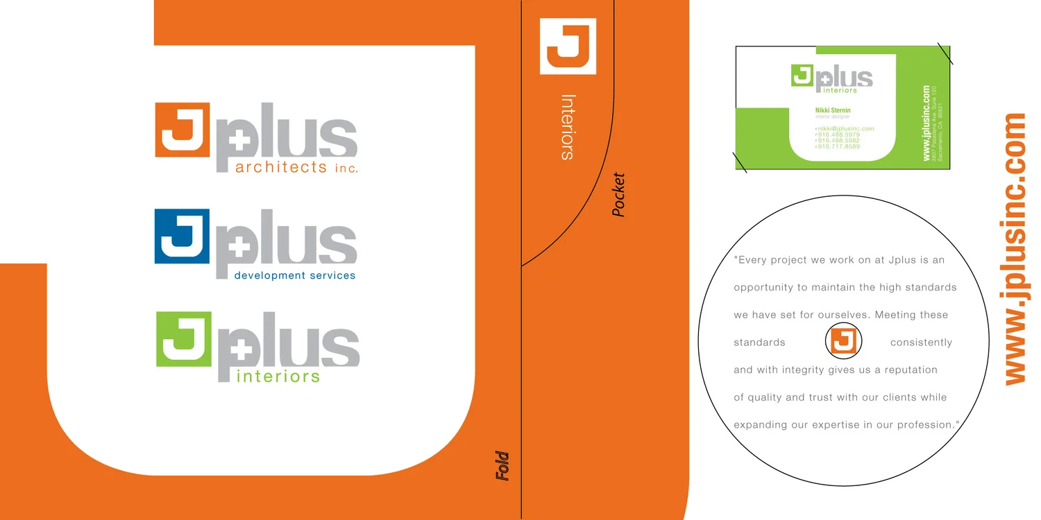
So we created a system where different cards for different divisions would display the division colors and titles in the tab di-cut.
We also included insets for the business card and a slot for the multimedia DVD or CD-ROM.
The entire brochure folded into a square with the logo Mark on it. They really loved the final design.

This is the outside packaging
This is how the inside looks with lines indicating where it folds and where the CD and buisness card are placed
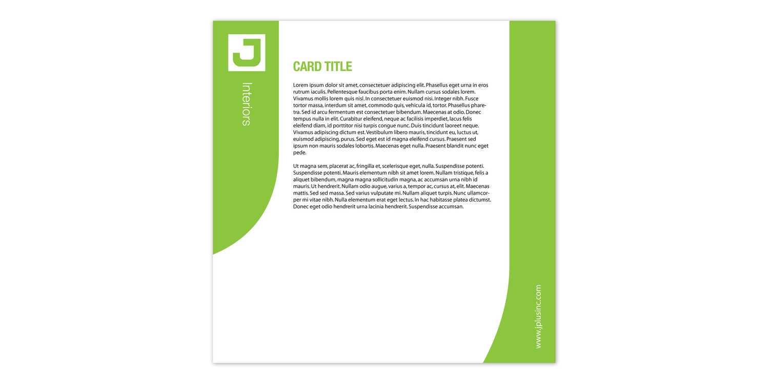
The system is modular so they can print out specific cards with different media and information suited for the client the brochure is assembled for. In this case, it is an interior design client.
The Green Color appears in the slot where the cards are located.
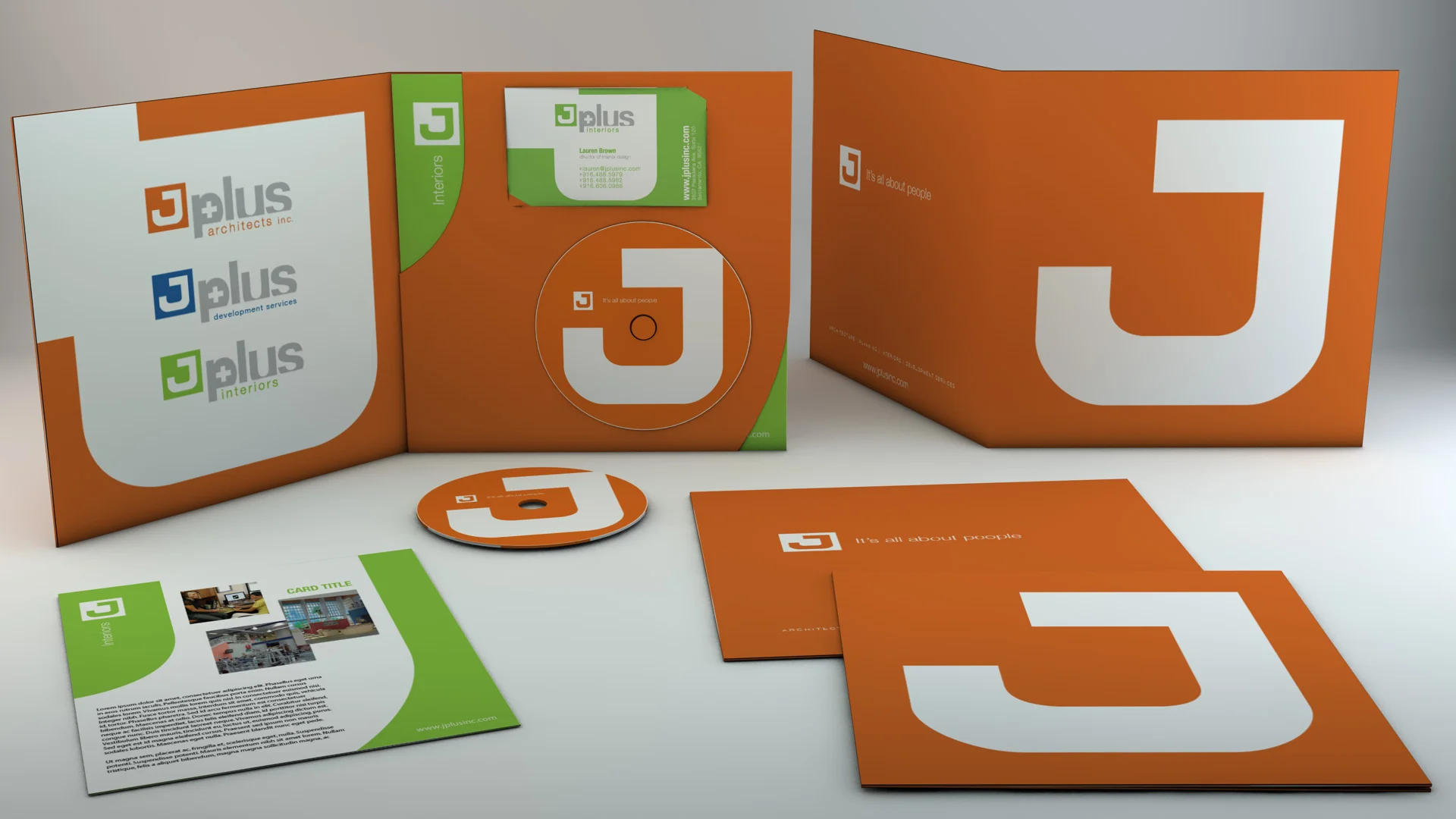
Here you can see how the brochure looks, both folded and unfolded with media included inside.
OVERVIEW
Overall, their unique needs as an architectural firm with multiple divisions and the way they needed to establish their brand as being design oriented and forward thinking came across as a thoughtful system that worked across the entire brand identity. It was designed to be modular and allow for the additions of future devisions as well as allow them to customize their design system and media for other needs beyond the original concepts.
As you can see, I am a thoughtful designer, even when the aesthetic is minimal and design function is as important as the application of visual principals and color theory.