
Video 1 : Version 7
Simplified the color combinations to adhere closer to the Microsoft Color Guidelines
Also removed smaller circle grids
Opening : Version 1
Visual concept is play on PARTNERS: “Overlapping divisions and individuals working together as partners”
Progression shows movement moving forward.
Centered strong logo, forward pulling, gestalt thirds
Opening : Version 2
Same idea as version 1. This time we have introduced an outside element to suggest an attraction or 2individuals forming a partnership.
Opening : Version 3
Following the same thought process as version 2, but went back to simpler colors
Opening: Version 4
Same continued thought, but bringing some color back
Opening : Version 5
Trying a different concept. Trying to show a partnership but keep the strength of the centered logo.
Showing partnership.
Maybe it’s too much like a Venn Diagram
Opening : Version 6
Last one. Tried to combine the 2 ideas and get some more of the solid color back.
Maybe the original ideas were better.
Closing : Version 1
Space relationships and position in the frame suggests we are coming towards the end.
Nice golden ratio scaling
Closing : Version 2
Same idea, just exploring whether or not it works better if it appears to be rising and pointing in the positive direction.
Video 1 : Version 6
Realized some of the layouts were too crazy, so I tried cleaning some of them up. I also figured out it works better with all the names in White. In v4 and 5 I was following the Style Guide for color in terms of what the primary text color is supposed to be on what colors. But once I saw them together, especially with the circles having alpha, it didn’t make sense for the names to be inconsistent.
Video 1 : Version 4
Style 01
Tried the simplest, most straight-forward approach
Style 02
Tried using Alpha channels as suggested in the email thread to make the layouts more interesting and less boring. Tried to use the overlap to draw focus to the names and regions
Style 03
Next, I tried being more creative with the color palette combinations to see if it gets us closer to the reference. Not sure if this causes any brand style guide issues or if it is more interesting and clever.
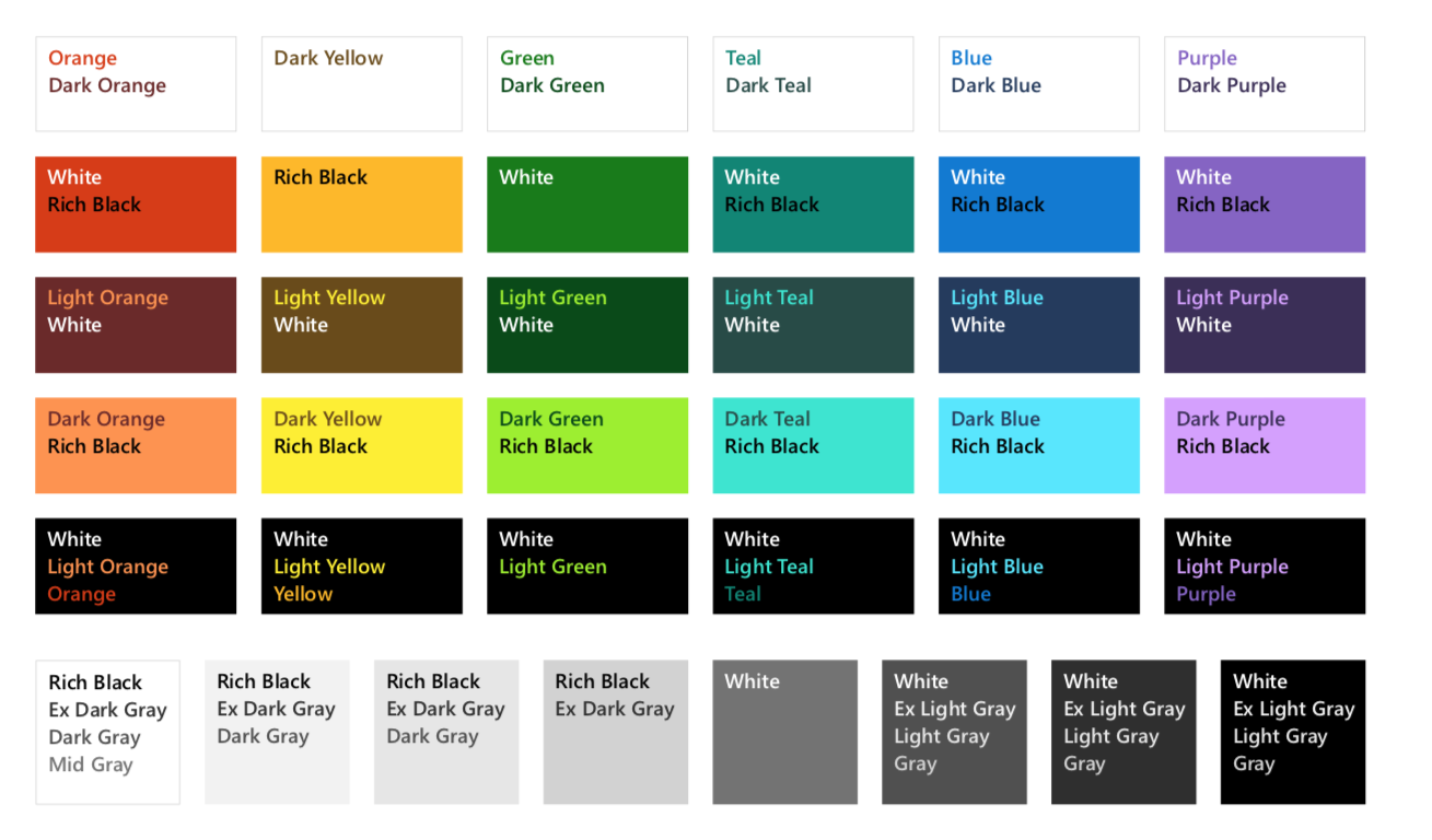
Microsoft Color Palette
I used this image to determine the color palette and text color combinations
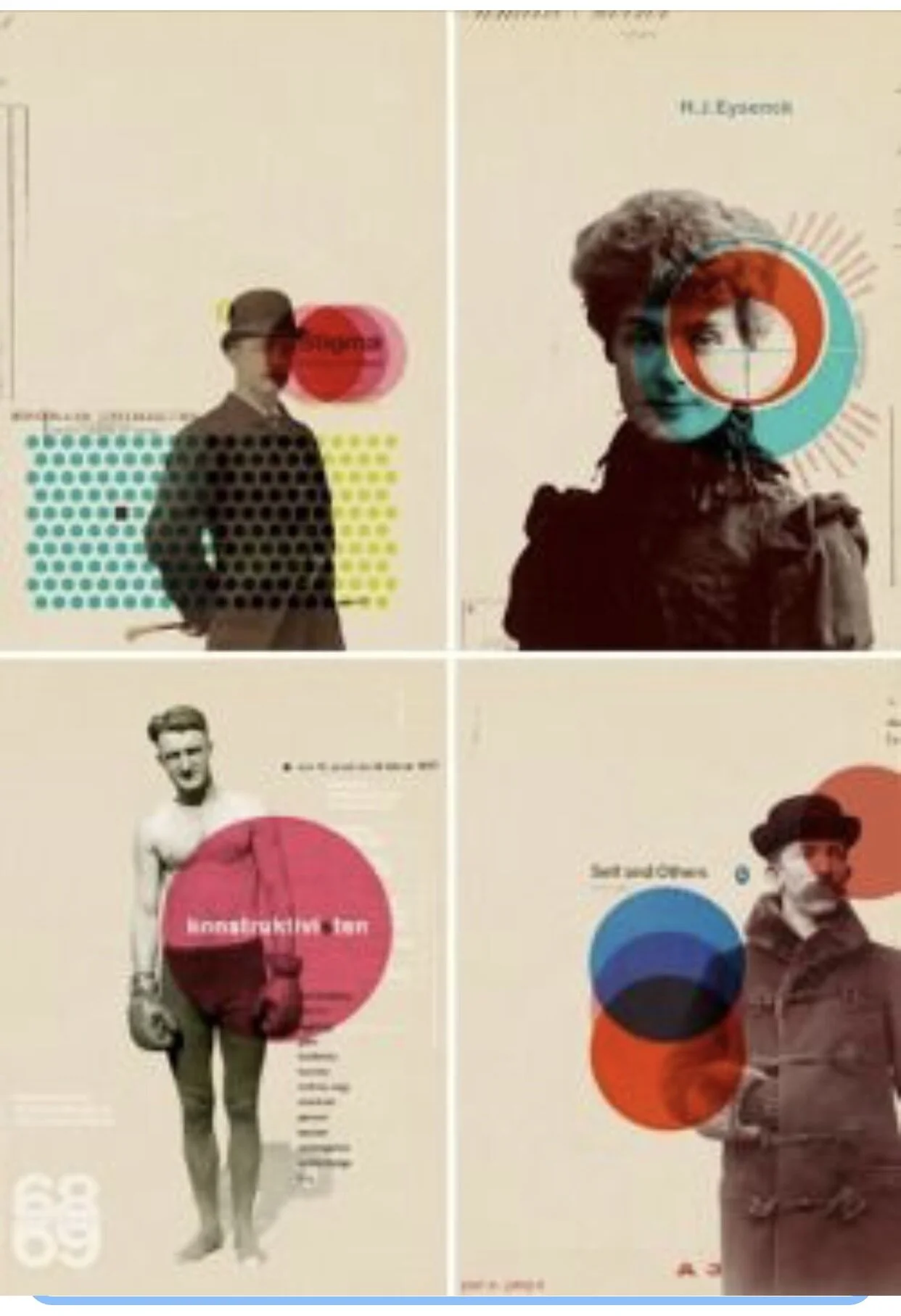
Original Reference